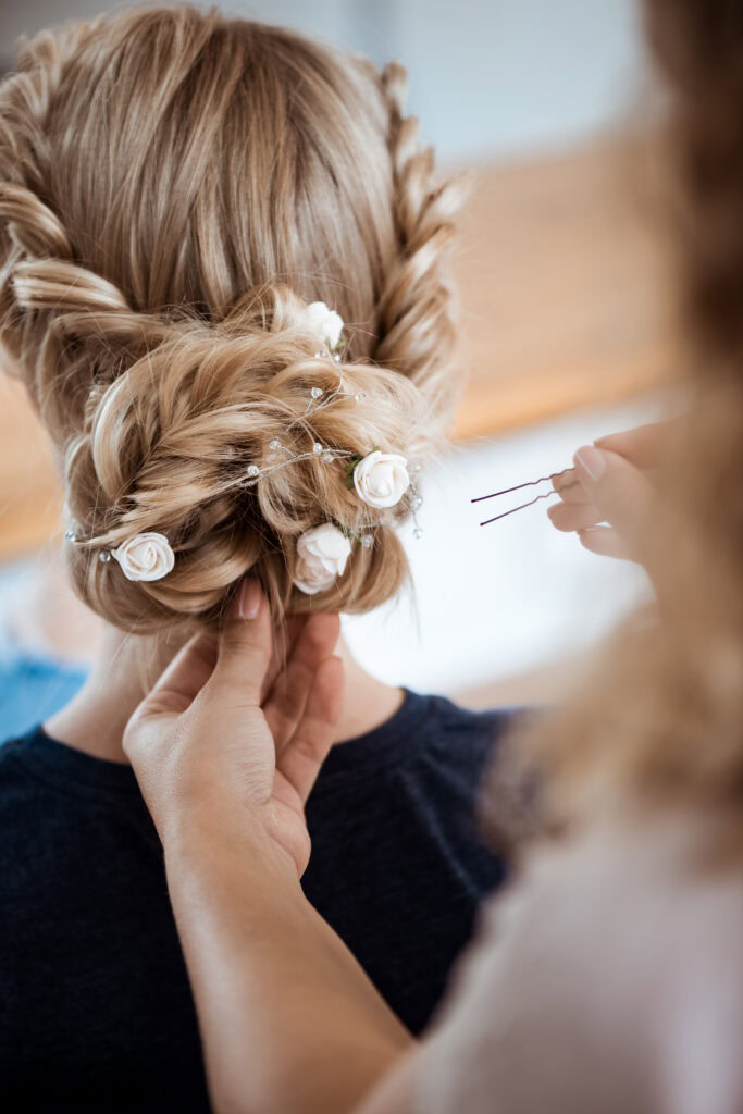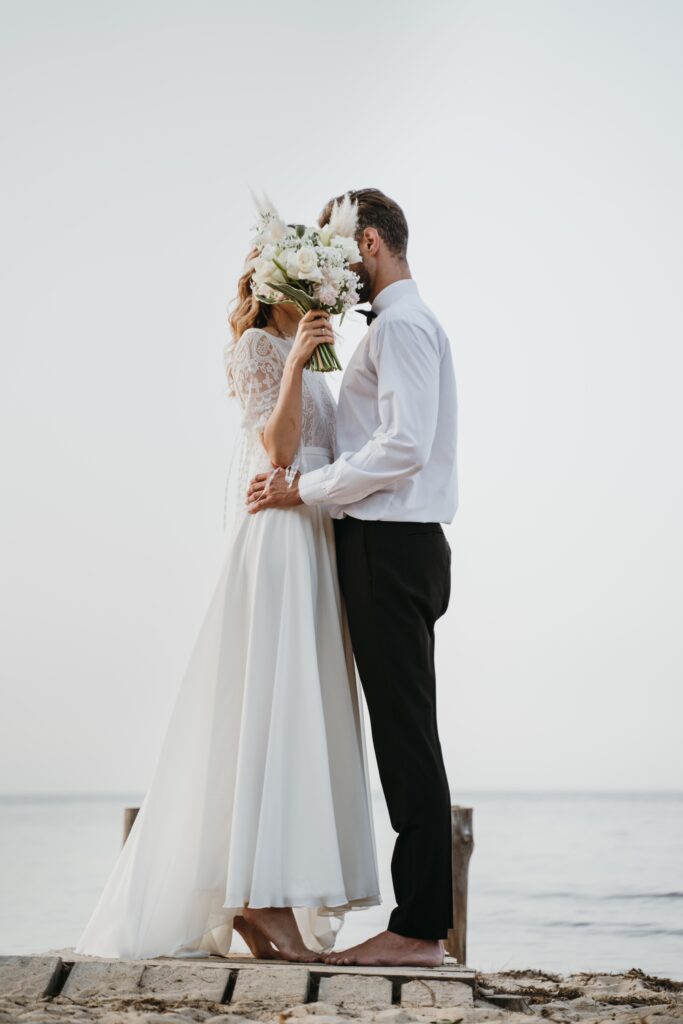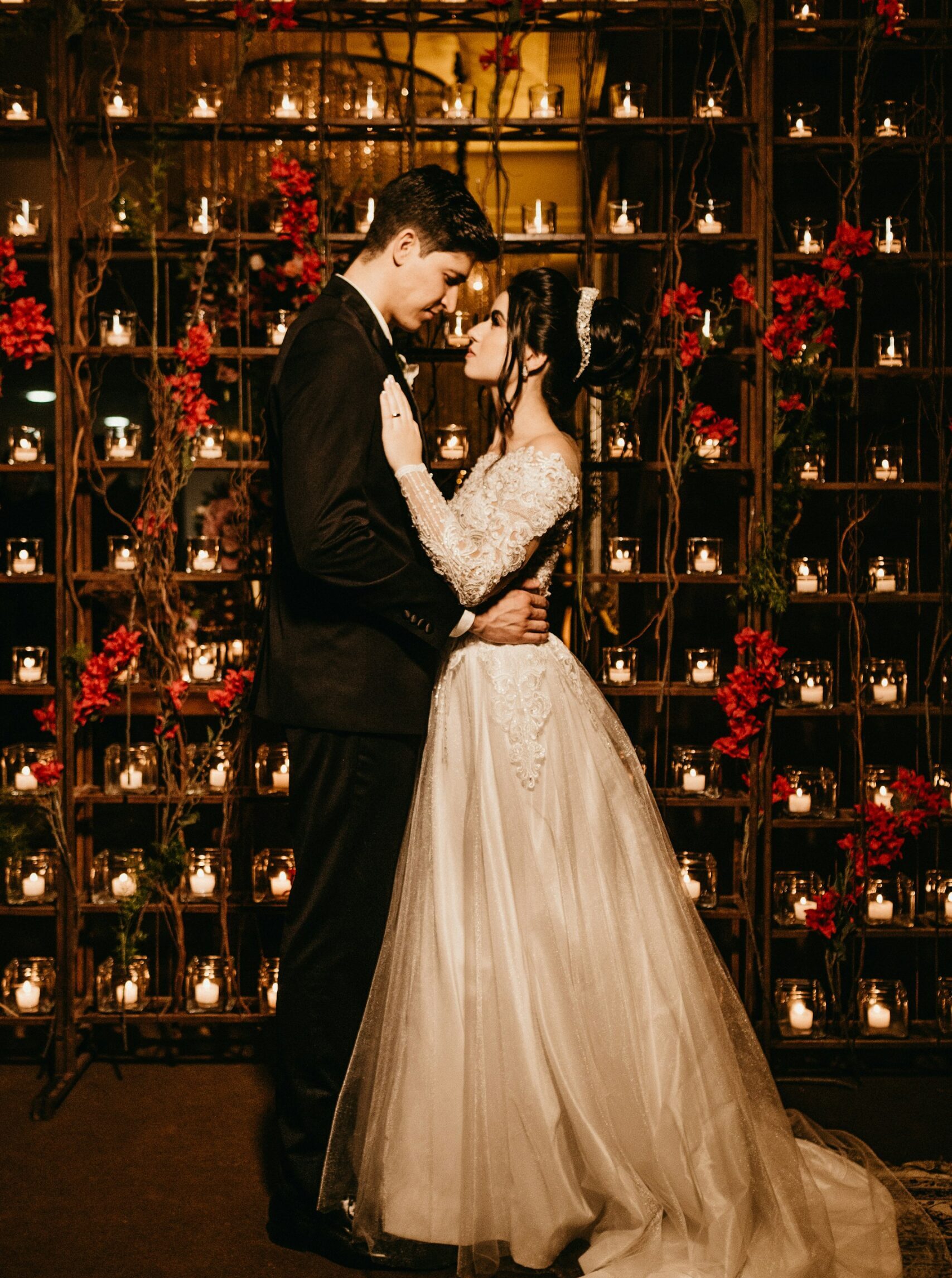
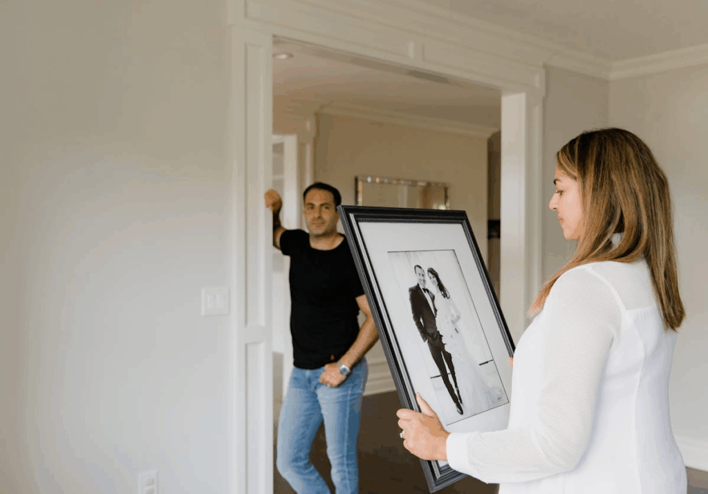
After the special day that is your wedding day comes the task of taking care of the memories. Framing your wedding is editing. You’re deciding which parts of a very full day stay visible in daily life. Most couples get flooded: hundreds of images from the photographer, airdropped phone pics, maybe film, maybe a few physical objects like dried flowers, fabric swatches, place cards. Much can be put in photo albums or storage, but keeping a few pieces in your living space can be a nice daily reminder of the day. The trick is narrowing without draining the feeling. Pausing before ordering prints and looking at the whole set.
There are a lot of ways to go about hanging your photos, one popular example is a photowall. When it comes to photowalls, it’s important to think of the balance. If every piece relates to the wedding, the wall gets heavy. Drop in neutral art to breathe. Minimal abstracts, calm landscapes or monochrome architectural posters from Desenio can stabilize color and mood.
Select what to frame
Dump your full gallery into a review pass. Mark anything that makes you stop, even for a second. Don’t worry about technical flaws yet. After the first pass, filter. Remove any near-duplicates, remove anything you’d be tired of seeing daily, remove anything dependent on context. Now step away. Look again tomorrow. Does that one still hit? If not, cut it.
Paper often ages better on walls than multiple photos. Invitations with strong typography, vow cards printed on thick stock, menus with letterpress texture – these give contrast. If you had a custom map, crest, or line drawing of the venue, it can sit between photo pieces and bridge tones.
Take a look around your space and think about what vibe you would like to bring to the room with your wedding photos, what would fit the space. Color wedding photography can fight with home decor if your space is muted. Converting one or two images to black & white can pull scattered palettes together. If your walls, furniture, and lighting run warm, a cool-toned black & white can be a good counterweight.
Select how to frame
The visual language of a photo wall is not just about the images, it’s also about the formats, materials, and how they interact. Mixing sizes adds a rhythm to the wall. A large focal piece can anchor the wall, while smaller images or objects give it space to breathe. Try combining different frame styles like wood, metal or painted frames. This can unite your photo wall with the rest of the room while still making a statement.
Pay close attention to where your pieces will hang. A kitchen backsplash, for example, often comes in glossy tile or colorful mosaic. These surfaces reflect light and introduce their own color cast, which can interact or even sometimes clash with your photos. Cool-toned images can feel sharp against warm terracotta tile, while muted prints might disappear against a patterned wall. In these cases, neutral,black and white imagery or float-mounted prints with clear borders can help create separation and balance.
Textures matter more than people think. Mixing surface finishes such as glossy photo paper, matte giclée prints, fabric backed frames or letterpress paper gives a depth and variation to your wall. A soft cotton mat or linen background around a photo can reference a wedding dress or table setting, making the memory feel more tactile. A dried flower shadowbox, a piece of ribbon or a small embroidered monogram can add dimension and draw the eye.
Written by: Lydia Bolmenäs